How To Color Match In Your Home
Sometimes deciding to redecorate starts with euphoria and quickly leads to angst and confusion. The decisions that need to be made can become so overwhelming. And the color is right up there on the anxiety list – it is a commitment so it must be done “right,” right? You are not alone – many people struggle with how to be creative with color while keeping the room or rooms cohesive. They wonder if their room is too garish or too boring. Or look at so many swatches that they all blur together until the only color you want to see is the lime on your margarita.
There are a few guidelines and suggestions when choosing colors that can take the pressure off and put the fun back into decorating.
Picking Your Colors
If you do not already have colors in mind, a good place to start is outside of your head. Colors invoke emotion. What “feel” do you want from a room? Cool blues might be optimal for a bedroom, or you want the guest room to feel like an English flower-garden. You prefer a relaxing spa-like bathroom or want to open the door to a jewel-box. Knowing how you want to feel in a room gives you a good place to start.
If you are completely overwhelmed and stuck, there are many places to look for inspiration. Go window-shopping and see what speaks to you. Is there décor or a color scheme in your favorite restaurant that you have always admired? Another great way to find your aesthetic is to flip through decorating magazines, and without giving it much thought, pull out pages you like. Once you flip through your stack of pages, you’ll see some common elements that called out to you.
Natural Colors
Or let nature guide you. Generally, a color palette you see and love in nature can be replicated in some way for your room. Looking around outside can give you some new creative ideas for your home. Similarly, like the ground is dark and the sky is light, you generally want to follow a darker floor, medium walls, lighter ceiling when you are figuring out colors.
Also, keep in mind that you don’t have to pick your main color for a room first. Any color that you want for a room – as an accent, for the trim, gives you a starting point. Of course, if you do have the main color in mind, that is great!
Some Color Basics
Let’s start at the beginning – all the way back to grade school. The good old color wheel is one piece of education that is still helpful today. First, there are primary colors: red, yellow, blue. Next come secondary colors, which are created from mixing primary colors. Purple is a combination of red and blue. Third are the tertiary colors, which are a mix of primary and secondary colors, such as yellow-orange or blueish-green. And then we get the many many color variations from there. Today paint stores can create almost any color you want.
“Complimentary” colors will appear across from each other on the wheel, while analogous colors are next to each other. Sometimes you will see a wall painted in a color that is “complementary” on the color wheel to the accent color. A familiar example of an analogous color scheme would be greens and blues. Usually, analogous colors are used for more casual, less formal spaces.
And that is color at its most basic. Of course, there are an endless variety of shades and tones for any color imaginable, as well as patterns, finishes, and textures to consider.
Picking Your Palettes
Where should you start in your house? Some people start with the largest room, some start with the most formal, some start with the room where they want the boldest color. Wherever you start, remember lines of sight between rooms. The foyer may look into the rooms on either side of it, and possibly the kitchen too. You want to create cohesion and flow with complimentary color palettes between any rooms that are already connected visually.
Once you have at least one color in mind for your first room, it can grow from there. You might want to use the same color in different shades throughout the room. You might want all neutrals or to mix in a couple of contrasting colors.
Be creative and open, but to keep rooms from getting too visually confusing or circus-like, a general rule of thumb is to not go beyond three colors for a room. Of course, each color can come in different shades, basically light, medium, and dark.
Basic Rules For Colors
When applying the colors, a basic guideline is the 60-30-10 rule: 60% of the room is the dominant color (walls), 30% is the secondary color (upholstery), and 10% is the accent color (accessories).
Of course, every rule was made to be broken. Saturating a small space in a bold monochromatic color can be very effective. It is all about scale and balance. Strong colors work to cover an entire small space but would make a large room feel heavy. For the larger spaces, you want to make sure there is a balance—other colors and tones that are the majority of the palette. Maybe an accent wall or accessories in the strong color you want to add.
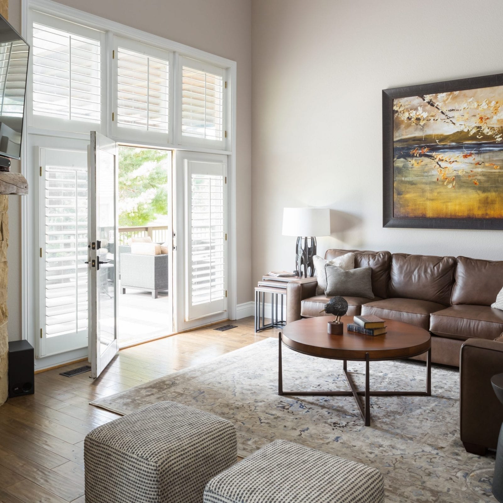
If you are drawn to the cool calm neutral palette, don’t be concerned it will be too boring. Neutrals are extremely versatile and allow for creativity—white and eggshell aren’t the only options anymore. There is a range of light and dark grays, blacks, browns, and yes, beiges. Pairing light and dark can create a dramatic contrast. Or combine cool neutrals and warm neutrals for some lovely complimentary contrast. Gray is being used more and more often for interiors for its versatility. It can complement another neutral or a bold color like bright pink. It can be classic or modern.
In addition to all the shades and tones of neutrals, choosing different finishes expands your creative options. High gloss draws the most attention and using that as an accent provides a more subtle contrast than a bight accent wall. While keeping the room far from boring.
0 comments